📣 Briefy Web 1.2: Ask in more scenarios, floating content on mobile, and more!
Following our recent Web 1.1 release on August 1st, we're excited to introduce Briefy Web 1.2, bringing you version 1.2 with significant new features and improvements designed to enhance your experience across different platforms. Here’s what’s new:
🗣️ Chat with your PDF
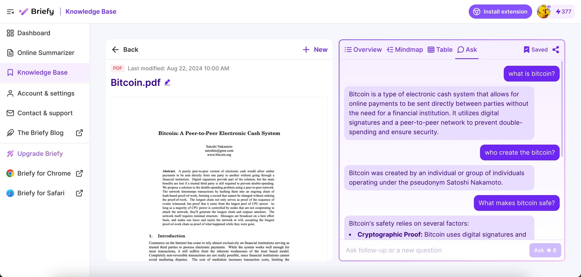
Ask is finally available for PDF files! This powerful addition allows you to ask questions about your PDF documents, just like how you interact with the Ask in webpage and video content. Previously, you can only query PDF content using the Universal Search function in Knowledge Base. But now, you can interact directly with the particular PDF content to get instant answers.

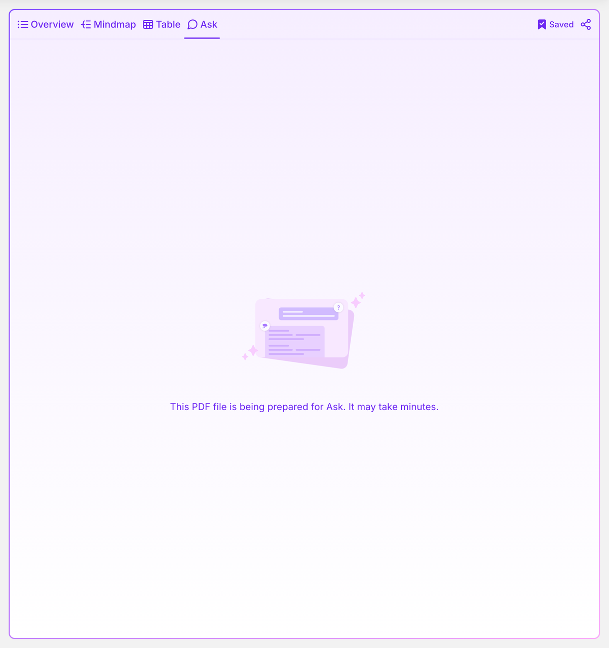
Please note that the initial indexing for Ask in PDF may take a few minutes as Briefy performs a deep analysis of the PDF's content. Once the indexing is complete, you can ask questions in natural language for a precise response, beyond what the summary alone can provide.
💬Ask on any shared page
We're expanding the Ask feature to shared pages! Now, when you share your Briefs publicly, every viewer visiting your shared page can directly ask questions about the content on the site. This means engaging more interactively with your audiences and friends or participating in discussions by asking follow-up questions on other people's shared pages.
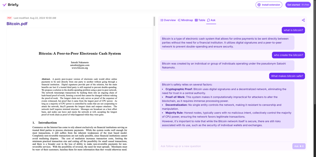
Keep in mind that this feature is available to users with an official Briefy account only, as it consumes credits to ensure a seamless and efficient experience for all.
☁️ Floating content viewer on mobile
Navigating summaries in your knowledge base on mobile just got easier with our new floating content viewer. In previous versions, reading summaries on your phone required scrolling up and down between the summary and the original content. The same applies when viewing summaries on a shared page.
Before (source content moves up when scrolling down)
Now, the original content will float alongside the summary and remain fixed at the top, so you can reference it without losing your place. You can fold and expand the content at any time based on your reading needs. This improvement streamlines the reading experience, allowing you to compare the summary with the source content effortlessly.
After (source content is fixed at the top)
⬆️ Improved access to the Online Summarizer
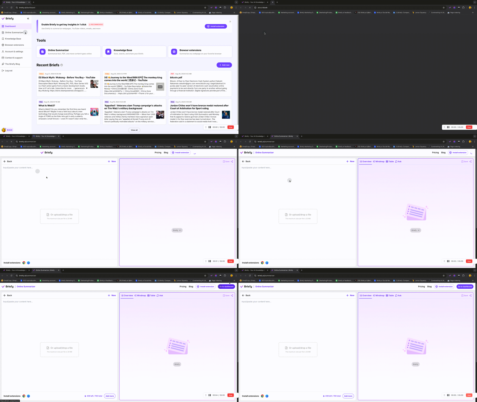
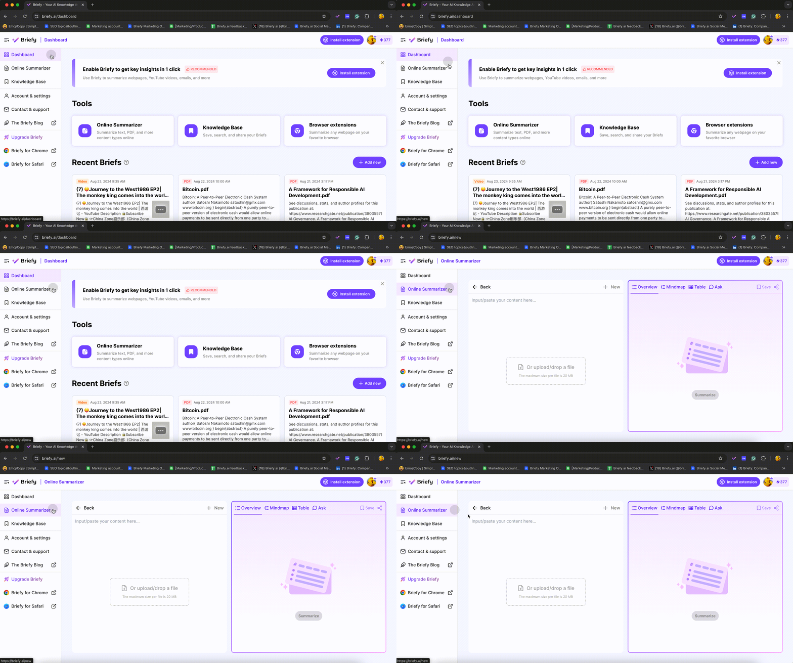
In previous versions, clicking to open the Online Summarizer from the Dashboard or when adding a new summarization in the Knowledge Base would automatically open it for you in a new tab. With this update, the Online Summarizer now opens directly within the current page, keeping your workflow more streamlined and reducing the need to manage multiple tabs. This small adjustment makes it easier to stay focused while working within Briefy.
With Briefy Web 1.2, we're continuing our mission to make information more accessible, interactive, and user-friendly. We hope you enjoy these new features and updates, and as always, we look forward to your feedback!
Visit our website to try out the latest features at 👉 https://briefy.ai/
